Log In

Home
    - Create Journal
    - Update
    - Download

Scribbld
    - News
    - Paid Accounts
    - Invite
    - To-Do list
    - Contributors

Customize
    - Customize
    - Create Style
    - Edit Style

Find Users
    - Random!
    - By Region
    - By Interest
    - Search

Edit ...
    - User Info
    - Settings
    - Your Friends
    - Old Entries
    - Userpics
    - Password

Need Help?
    - Password?
    - FAQs
    - Support Area


sephiroth ([info]sephiroth) wrote,
@ 2008-02-04 19:18:00


Previous Entry  Add to memories!  Tell a Friend!  Next Entry
graphic ppl on my flist? plz help?
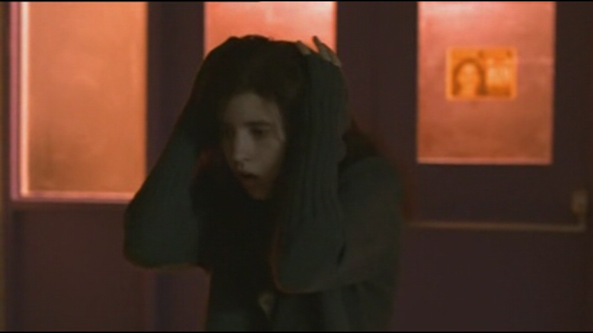
I'm trying to make icons from one movie and the other is a tv show.

I can't seem to make them not look either grainy or too weird when brightened. Could anyone give me advice?

Here is all I know how to do in Adobe.

Match Color
Levels
Variations
Soft Light
Screen
Overlay
Seletcive Color


Below the cut is the images that have been particularly difficult for me.
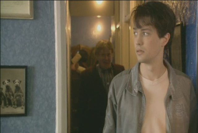


I just can't make them NOT suck. :/


(Post a new comment)


[info]ludivine
2008-02-05 07:12 pm UTC (link)
Personally, I think the second one is unsalvageable--you could make it useable by screening + sharpening the shit out of it, but both the lighting and quality are so bad I don't think it's possible to manage to make it pretty. As for #1, the contrast and saturation are low, so taking the standard screen + soft light formula everyone knows, I'd just duplicate the soft light layer once or twice extra, and possibly duplicate the screen if it gets too dark after that.

(Reply to this)


scribbld is part of the horse.13 network
Design by Jimmy B.
Logo created by hitsuzen.
Scribbld System Status