 |
![[info]](https://www.scribbld.com/img/community.gif) objection (posted by objection (posted by ![[info]](https://www.scribbld.com/img/userinfo.gif) mei) mei) |
| 2008-05-05 15:40 |
| Tutorial 3: Fire's a Beautiful Sound |
| Public |
| busy |
| Sweet - Ballroom Blitz |
|
I figured in a fit of anger to write out another tutorial hehe. This one isn't one of my favorites, but was a fun icon to work with any ways. Hopefully there's a trick or two involved in this tutorial that assists you in making your own stuff. Photoshop only, I think, since it involves Hue/Saturation and Color Balance layers.
FIRE'S A BEAUTIFUL SOUND - TUTORIAL 3
 to
to 
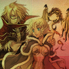
» Prepare your base.
» My own base was a bit too light so I decided to duplicate the base and set the new layer at multiply 30%

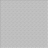
» Take this texture (maker unknown, sorry ~) and set it to a new layer, multiply 100%
» Well now it's difficult to see the characters. It's okay though, that texture was just for a prettier background of the entire icon. Duplicate the first two layers (the base and the multiply layer) and set it as a new layer. This is where I cropped away as much as the white space as I wanted. You can be fairly lazy with this process, because the next step helps hide it if you used a white background. Personally I was in a rush to finish this icon for animechorus, so I didn't crop it too well :p

» Next step, I control + clicked the later to select all the empty space. Making a new layer, I went to edit -> stroke and added a stroke of 2 pixels, white, to the OUTSIDE (location). This help hides the crappy crop job I did. You can feel free to skip this step if you did a good cropping job or don't want a stroke. I set the layer to screen.

» I wanted to bring out certain colors in the icon, so I went to make a color balance layer (layer -> new adjustment layer -> color balance). Tinker around with the settings until you get something that looks perfect for your icon. Since this was a firey icon, I focused on reds and oranges.

» I've been on this huge Hue/Saturation kick so it's only natural I brighten up the icon a bit by doing that. Later -> New Adjustment Layer -> Hue / Saturation. I'm sure I did nothing too special except adding on more Saturation and finding a nice Hue to play with.

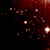
» I took a light texture focusing on the color red (maker unknown sorry!) and slapped it down as a new layer, screen 100%

» Texting time! I didn't do anything terribly fancy with this. I wrote 'Fire's a beautiful sound' in Adorable, 12 point. I also added a white stroke around the words, 2 pixels with screen opacity. This layer remains on normal.

» For this next step, I use a trick that was taught to me and one I don't feel would be nice writing up in a tutorial. So instead I'll give you the lazy man's method I use to use. Take this brush and set it as a new layer in black. Set the new layer to soft light and change the opacity. I usually run it low, anywhere between 10% - 30%, but it has a nice effect at deeper opacity levels as well. You can erase out of the background, if you want it to just be on the focus of the icon - which is what I did. There's a lot of different brushes you can use, some with diagonal line effects and others like the one I linked. It's a user's preference really.

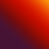
» Next I took this beautiful gradient (once again maker unknown) and set it at lighten 100%. Different gradients work for different icons. Heck making your own could work just as well.

» Select all and make a new layer. Stroke -> 2 pixels white on the INSIDE (location) to create part of the border. I left this layer on normal.

» Next take this brush by wickedenough@livejournal.com and with the eyedropper tool, find a color in the icon you like and stamp it onto the icon. Ta-da, pretty nifty border achieved!
As always, I have the original .PSD I can send to people if they want the specifics. I'm sorry I don't have the actual colors / numbers for the hue/saturation and color balance levels, but this helps you build your own icon~
Post A Comment | Add to Memories | Tell a Friend | Link